-
This email address is being protected from spambots. You need JavaScript enabled to view it.
Tekmos' Blog
Tekmos' Blog
Tekmos Logos & New Look
Along with the move to our new facilities, Tekmos is getting a new logo.![]()
So how did this happen?
Our current logo is just our name in the common Ariel font. We stepped out of the box when we added a maroon underline. It worked, but it was pretty bland.
The act of moving into a new building means that we have to pay for a sign. Our artist suggested that it was a good time for a new logo, so I turned him loose. What I got back was our name in all caps, a more distinctive font, and a stylized chip.
Many companies pay staggering amounts of money for a graphic symbol that is to represent their company. AT&T has a stylized globe. Mercedes has their three point star. McDonalds has its golden arches. And Tekmos now has a chip. And I love it.
What I like the best is that the graphic represents what we do. And that is rare in the world of logos.
The logo can also be easily modified for special applications. Here is a variation at we may use on our shipping boxes.
![]()
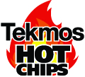
And here is a modification of our Hot Chips logo.
Perhaps the most difficult aspect of our new logo was the color red. The first pass had a red that was different on different monitors, and when printed. This was a problem since almost all of our documents are electronic. After a few go-arounds, we settled on a red that is the same in every media.
We are now implementing the logo on business cards, stationary, boxes, brochures, data sheets, and the web site. And with that, we get a whole new set of challenges, which I may talk about later.
When you subscribe to the blog, we will send you an e-mail when there are new updates on the site so you wouldn't miss them.